Introducing Tripdeck:
Seamless flight importing for FlightTrack 5
Today we’re excited to finally introduce our new flight-importing service, Tripdeck! Getting your flights into FlightTrack 5 is now a cinch and makes managing your travel as easy as forwarding your flight confirmation emails. The service is simple, fast and best of all, FREE.
Here’s how it works: when you launch the 5.2 update of FlightTrack, you’ll have the option to sign up for a Tripdeck account or log in with an existing Expedia account. Once you’ve created your account, you can begin forwarding confirmation emails for your upcoming travel to trips@expedia.com. When your trip is available in FlightTrack, we’ll send you a push notification. We even pull out your confirmation numbers and seat assignments so you’ll always have them on the go!
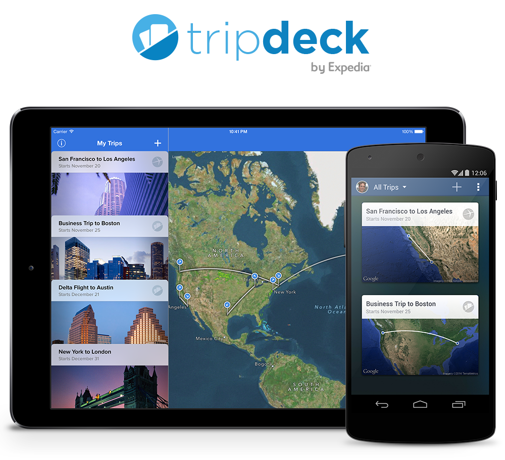
Tripdeck works with FlightTrack 5 on iOS and Android, phones and tablets, ensuring that all your imported flights are available on all your devices, regardless of platform. Want to forward your confirmation emails from a different email account? No problem! You can add additional email addresses from which you can forward your confirmations to your Tripdeck account.
In FlightTrack, you can delete any flights you’ve sent to Tripdeck or edit the name of the trip. Additionally, if you book your flights on expedia.com, there’s no need to forward your confirmation email. They’ll show up right in FlightTrack without you having to lift a finger.
We built Tripdeck on top of Expedia’s existing account architecture because our parent company has proven experience maintaining a secure and robust account service. To handle the parsing of confirmation emails, we partnered with WorldMate, a leading provider in itinerary parsing services, for their broad support of hundreds of airlines and travel sites.
Believe us when we say, we’re as happy as you are that Tripdeck is now in your hands. Thanks for your patience and we can’t wait to hear what you think.
The New FlightBoard for Android Has Arrived!
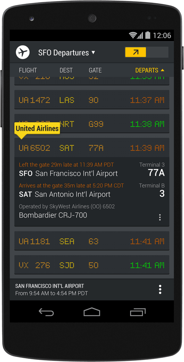
A refreshed FlightBoard has arrived on Android!
We’ve created a sleeker design with some exciting new features that you helped us envision. Now you can:
- View a flight’s marketing and operating airlines
- Use your current location to find nearby airports
- Filter by domestic and international flights at an airport
- View the aircraft type (when available)
- Easily switch to a flight’s corresponding arrival or departure airport
- Long tap to display the full name of an airline or airport
Thanks for your feedback — keep it coming.
You can download it now on Google Play. Check it out and let us know what you think!
FlightTrack 5.1 Arrives for Tablet
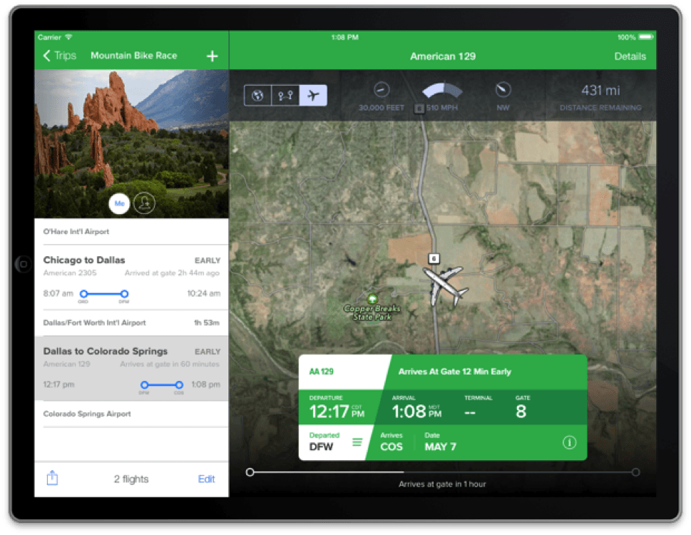
Today, we’re introducing a beautiful new tablet experience with FlightTrack 5.1. The updated FlightTrack features a stunning tablet experience for both iOS and Android and is available as a free update for FlightTrack 5 users on Apple’s App Store and Google Play.
In addition to the tablet experience, FlightTrack 5.1 adds gorgeous destination images to your trips, provides an integrated FlightBoard (our award-winning app) view, and now allows you to easily share all of the flights in your trip with friends and loved ones.
We’ve taken advantage of the additional screen real estate to show more data about your flights, and with fewer taps, all while creating a visually immersive experience. We’ve also fixed a few bugs here and there and enhanced FlightTrack on the phone as well.
At Mobiata, our mission is simple: build beautiful experiences that make travel easy for people. With that in mind, our entire team continues to work hard to ship what many have been waiting for: an itinerary parsing and syncing service. Stay tuned! This will be an exciting summer.
The New FlightBoard Has Landed!
Today, we’re excited to present a new look for FlightBoard!
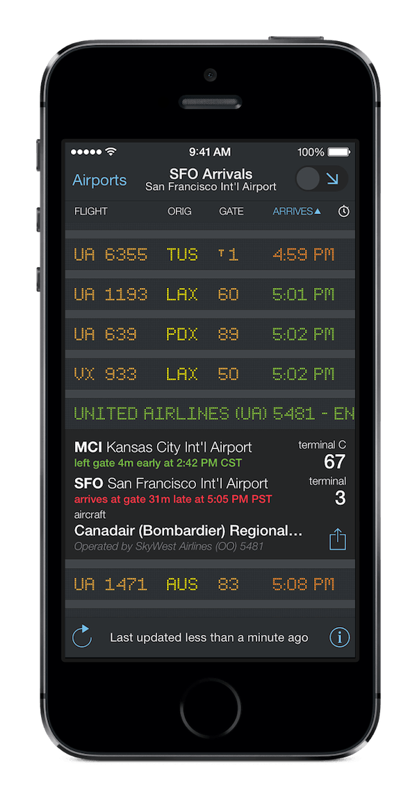
While keeping the unique charm of our Charles de Gaulle flight board-inspired design, we’ve steamrolled it into something that will feel right at home on iOS7. We’ve stretched the design right to the edges of the screen to help you find the information you need quickly.
In addition to the updated look, FlightBoard now displays both marketing and operating carriers for flights, which comes in handy if you need to search for alternate flights.
Whether you’re checking your flight status at the airport or daydreaming about the next getaway on your couch, we hope you enjoy the latest version of FlightBoard.
You can download it at the Apple App Store. And as always, let us know what you think!
We Miss It, Too: A message to our FlightTrack Pro users
Friends,
With the launch of FlightTrack 5 today, some of you expressed surprise about the new app’s lack of a TripIt integration feature. We share your frustration. Although we built and tested TripIt integration during FlightTrack 5’s development, we have not been given the necessary permission to enable this feature in the app. As a result, we are exploring our options and considering alternatives so that you can continue to easily import flights into the app.
We want to reassure you that prior versions of FlightTrack Pro continue to sync with TripIt. If you already removed FlightTrack Pro from your device, please refer to our iOS and Android support pages for help restoring your purchases. As soon as we are able to integrate a solution in FlightTrack 5, we will be in touch.
At Mobiata, we strive to build the most useful and beautiful travel apps in the world, and as always, we are hard at work ensuring that FlightTrack remains the indispensable tool that you expect.
Safe travels,
Heidi
User Happiness Lead
Please continue to share your feedback:
Android email: FlightTrack-Android@mobiata.com
iPhone, iPad, iPod touch email: FlightTrack-iOS@mobiata.com
Wheels Up! FlightTrack 5 Takes Off
This time of year brings us closer to friends and family, but often only after enduring hectic airports, middle seat assignments, and flight delays. Air travel can be stressful and unpredictable, and while we can’t guarantee an on-time departure, we at Mobiata strive to make it a little more pleasant.
Today, we’re pleased to release the biggest update to FlightTrack since it was first introduced in 2008. After listening to your feedback, we’ve completely redesigned the interface, streamlined the interactions, and implemented some useful new features to help you stay on top of holiday travel:
- You can now group everyone’s flights intro trips and tag the traveler – whether it’s you, your friends, or family.
- Discover if your flight is equipped with Wi-Fi so you can send those last few emails before you land.
- Share your journey home through a beautiful real-time animation of your flight path.
Best of all, features like push notifications and terminal maps, previously only available in our “Pro” version, will keep all users of the new FlightTrack informed of every flight delay and gate change.
FlightTrack 5 will replace older versions of the app and is available in the Apple App Store and Google Play at an introductory price of $2.99 until December 1, 2013, after which time the price will be $4.99.
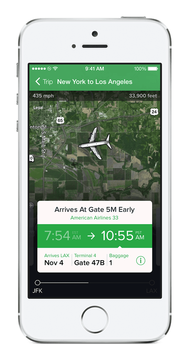
Although we think this is our best work yet, we’re already back at work improving on what we’ve started. We’ll be adding some exciting features and providing more device support in the coming months. In the meantime, we hope that FlightTrack brings you some holiday cheer.
5 Years of FlightTrack: Reflecting Back, Looking Ahead
We’ve been hard at work on FlightTrack for the last year, and we’re pretty excited to announce that our brand new app, FlightTrack 5, was submitted for approval.
FlightTrack 1.0 was released in 2008, 5 years ago. Mobiata has come a long way since then—from a side project by our founder Ben Kazez to a team running the mobile vision for one of the world’s largest travel companies at Expedia. We’re pretty proud of what we’ve built along the way, and we’re incredibly excited for what we’re going to be releasing over the next year, not the least of which is FlightTrack 5.
About a year and a half ago, we decided we wanted to get FlightTrack into the hands of as many people as possible by releasing a free version, restricted to tracking a single flight. As we got further along the design and development process, something occurred to us: this didn’t feel like the Mobiata experience we wanted new users to have—a crippled version of FlightTrack. We stepped back and, instead of releasing a pared down version of FlightTrack 4, re-thought from the ground up what a single flight tracking app would be like. It wouldn’t have all the bells and whistles like push notifications or FlightBoard integration. But it should do one thing incredibly well: track a flight.
We created a single view app, where your flight details hovered over a live map. When your flight took off, we zoomed in to your plane so you could follow along from the ground below. The reaction was incredible. We received an amazing number of downloads, and we kept hearing from our paid FlightTrack customers: “When can we get this?” We took what we learned from FlightTrack Free and with FlightTrack’s 5-year anniversary ahead of us, decided to craft a brand new FlightTrack, from the ground up. We knew this was a pretty big undertaking, but we had the benefit of building on the same solid back-end you’ve come to know and trust.
As users of FlightTrack Pro ourselves, we wanted to bring the pro experience to every FlightTrack user, and remove the confusion and complexity of three different versions. We put our focus on FlightTrack 5 as a single, unified version, and we’re taking most of the pro features like push notifications that have been in our $9.99 version, and bringing them to FlightTrack 5, priced at $4.99. We’re also adding in some great new features like trips and flight sharing.
We were pretty excited and began gearing up for a release for the critical summer travel season. In June, the world got a glimpse at iOS 7. As we watched the keynote and let the new UI sink in, we began to realize there was no way we could release our flagship Mobiata app as an iOS 6 app. We scrambled to reskin the app, but it became apparent that the changes in iOS 7 weren’t simply skin deep. We needed to spend the time to go back and redesign the app again for iOS 7.
We set a target to be on the app store the day iOS 7 launched, but designing for iOS 7 turned out to be a bigger task than even we had realized. We couldn’t ship our Android and iOS apps as divergent products or at different times. We missed our date, but we haven’t been willing to compromise on our experience, and we’ve been working hard on both platforms since that time to get FlightTrack 5 out the door. To launch ahead of the busy holiday travel season, we did make one major cut—we’ve focused on the phone experience first and foremost, with our tablet experience following in the coming months.
We couldn’t be more excited to get FlightTrack 5 into your hands, particularly on the eve of Mobiata’s 5-year anniversary. We truly appreciate all of our FlightTrack users over the years, and we can’t thank you enough for your support and passion. We think FlightTrack 5 is a pretty big deal, and a bold step toward a new future for FlightTrack—and Mobiata.
Beyond the Design Guide - Expedia
From Google I/O 2013: “Mobiata’s Chris Arvin discusses Expedia’s approach to Android design and highlights how additional "nice-ities” in the app experience drive customer loyalty and user growth.“
MBRequest — A simple networking library for iOS and OS X
Making network requests is one of the most common activities apps perform, especially on mobile devices that are always connected to the internet. While Apple gives us some classes and tools to help us perform these requests, it is left as an exercise to the developer to do so in a clean, reusable way.
Today, at Mobiata, we are announcing MBRequest, a simple, open source networking library for iOS and Mac OS X. It uses a blocks-based API built on top of NSURLConnection and NSOperation. MBRequest follows the style of Apple’s CLGeocoder class to create simple, easy-to-use classes that encapsulate the entire network request. The goals of MBRequest are as follows:
- Create the simplest possible API for making network requests. With only a few lines of code, developers should be able to start a network request and pass along a single block of code for handling the results of that request.
- Give developers an extremely simple way to create their own CLGeocoder-like classes. These subclasses should only need to worry about setting up the request and parsing the response.
We hope you like it! Be sure to check it out over on its GitHub project page.
Introducing Twine- String Management for iOS, Mac OS X, and Android Development
I recently discovered that about 50% of our total app downloads at Mobiata originate from countries other than the United States. This really demonstrates the importance of properly supporting your international customers as such a large percentage of your sales depend upon them. However, localizing and translating your apps can be a very involved process.
In this post I hope to show you just how bad the standard localization process is for iOS and Mac OS X apps, and how we have found a way to make it much easier for developers to localize their apps and then maintain these localizations and translations over time. In addition, I’ll show you how you can easily share your translations across multiple apps and platforms. This will save your company money that would otherwise be spent duplicating your translation efforts, especially if you are developing for both iOS and Android.
The Standard iOS and Mac OS X Localization Process
The standard localization and translation process for strings in iOS and Mac OS X apps can be whittled down to the following key steps:
Go through your source code and replace all strings that need to be translated with appropriate calls to the
NSLocalizedStringmacro. For example, you would replace@"Hello World!"with something likeNSLocalizedString(@"Hello World!", @"A comment for the translator about this particular string.").Run the
genstringscommand line tool to extract all of the strings from your source code into one or more.stringsfiles.Run the
ibtoolcommand line tool to extract all of the strings found in your various XIB files.Send the files created in steps (2) and (3) to each of your translators. They will edit these files, replacing English strings with their appropriate translations. When they are done, the translators will send these files back to you.
The translated
.stringsfiles from step (2) should be included directly in your project. The translated.stringsfiles from step (3) should be used byibtoolto generate a bunch of additional XIB files which should also be included in your project.Manually go though all of your newly generated XIB files to make sure that your interface still looks good, especially in languages that tend to be a more verbose than English. Make adjustments to the layout of elements in these files as needed.
Yes, this is the standard process that Apple recommends for localizing and translating your apps. I, however, would not recommend this process to anyone, as I believe it to be fundamentally broken for a number of reasons.
The Standard Localization Process is Broken
genstrings does not do merging
genstrings is a very basic tool. It simply reads your source files and generates one or more .strings files. It does not account for any translated strings that you may already have. For example, say that you released version 1.0 of your app with support for 11 languages including English. This means that you have 10 translated .strings files that you shipped with your app. Now, let’s say that you want to release 1.1 which adds 12 additional strings that you need translated. What are you going to do?
You could run genstrings again to create a completely new .strings file for your translators, but there’s no easy way to communicate that they only need to pay attention to those 12 new strings. It’s possible one of your old strings changed slightly, too. Manually adding the 12 strings to your old, translated files is not especially productive. Some translation companies have systems that will help manage all of this for you, but many do not.
XIBs are not a good place for one-off modifications
After creating translated XIB files with ibtool (step 5 above), I have often seen it recommended that developers edit each of those new XIB files to make any necessary modifications due to differences in strings lengths. These modifications can be anything from changing font sizes to completely resizing or rearranging some of the views. Doing this places too much knowledge of minute layout differences in your XIB files, which can make your applications hard to understand later. This brings us to the golden rule of working with XIBs: Never manually edit the files generated by ibtool. If you need to make modifications to the layout of your XIBs due to differences in string lengths, do so in code (awakeFromNib is a great place for this). I think it is much easier to manage a single block of code that modifies layout than it is to manage 18 XIB files.
The English text is the string key
genstrings assumes that the English text for your string is also the string key, which is a horrible convention. What if you need to fix a misspelling in your 1.0.1 release? The translated copies of this string are most likely fine, but if you modify the English text (which resides in your source file), you are also modifying the string’s key. So, to fix a simple typo, you literally have to edit your source code to fix the string, and then update the string key in each of your translated .strings files. If you support 12 languages this means editing 12 files to fix one typo!
There is another reason why using the English text as the string key is wrong. How do you handle words that mean completely different things in different situations? For example, take the word “list”. You could use it as a noun (the title above a UITableView displaying a list of items) or as a verb (a button title describing the action of listing items on an auction site). While these may be the same word in English, they will most certainly not be the same words in other languages.
However, there is one important thing to realize about switching up your string keys: Apple did not implement a fall-back system for .strings files. This means that if a string key can not be found in your French Localized.strings file, the system won’t use your English translation, even if it exists. Instead, your users will just see the string key. So, everything seems to work as you would expect if the English text and the string key are the same, but once you change it up and use an actual key for your string, you have to ensure that all of your .strings files always contain all of your strings, whether or not they are actually translated into the appropriate language.
Your strings, comments, and translations are duplicated and scattered across many files
If you’ve used genstrings before, you may have noticed how it handles finding the same string with two different comments. You are given the following nice warning message:
Warning: Key "Hello" used with multiple comments "First Comment" & "Second Comment"If I use the same string multiple times in my project, I have to worry about whether or not I am using the same comment each time? I understand the importance of the warning message here, especially if the two comments are giving contradictory information, but as a programmer it’s not something I should have to worry about.
This brings us to an unfortunate fact about the “standard” way of localizing your apps: all of your string data is spread out across countless source code and .strings files. Wouldn’t it be nice if they were all centralized in one location?
Enter Twine
We decided that we needed a better way to manage our strings. We looked into a few applications and scripts that claimed to help with this painful process, but couldn’t find anything that we liked. Instead, we decided to build our own. Twine is an open-source command line tool written in Ruby that manages all of your strings, comments, and translations in a single text file. Twine parses this file and then generates all of the .strings files for you. Or, if you’re building an Android app, Twine can generate Android .xml string files.
Not only does Twine generate .strings and .xml files, but it parses them, too. If your translation team is more comfortable editing Android files, just generate them and send them to your translator. When the translator is done, Twine can identify any strings that have changed and write them back to your master strings data file.
With Twine, we have complete control over the generation of these .xml and .strings files. We don’t have to worry about our developers or translators forgetting to escape a double quote or forgetting to put a semicolon at the end of each line. And, if we have a change we need to make to a number of strings across all of our languages, we have a single, easy place to do so.
For example:
[yes]
    en = Yes
    da = Ja
    de = Ja
    es = Sí
    fr = Oui
    ja = はい
    ko = 예
[no]
    en = No
    da = Nej
    de = Nein
    fr = Non
    ja = いいえ
    ko = 아니오
[path_not_found_error]
    en = The file '%@' could not be found.
    comment = An error describing when a path on the filesystem could not be found.
[network_unavailable_error]
    en = The network is currently unavailable.
    comment = An error describing when the device can not connect to the internet.
Twine also supports using only a subset of your strings when generating the output file. This way, you can have multiple apps across multiple platforms share the same strings data file. At Mobiata, we share the same data file across FlightTrack, FlightBoard, and Expedia Hotels. Sharing a string across apps and platforms is as easy as editing a single line in your master strings file.
We are very happy with Twine and hope that you like it and can find a use for it in your own projects. You can find more information about Twine (including a lengthy README) on its GitHub page. Or, you can install it right away as a Ruby gem.
FlightTrack & FlightBoard for Google TV
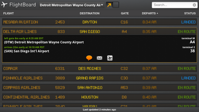
Google just rolled a brand new update to Google TV that brings the full power of Android’s Honeycomb platform into your living room. With this update, you can now download many of the over 600,000 apps currently available on the Android Market and interact with them on your Google TV. We’re excited to announce that we’ve been working to create the perfect Google TV experience for FlightTrack and FlightBoard. We’ve redesigned them to look beautiful on, and take advantage of, a full HD experience.
We’ve made FlightTrack work with your device’s remote control and the new left to right flow works elegantly and looks brilliant from 10 feet away on your couch.
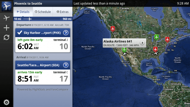
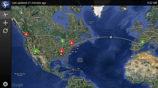
You can watch your flights traverse the beautiful satellite maps in all their 1080 HD glory.
or let FlightBoard turn your living room into the Arrivals or Departures board at Charles de Gaulle as the new full screen experience fills your room with the excitement of travel.
We’ve put a lot of thought into bringing the best mobile travel apps onto your phone and now we’re bringing them into your home, and we can’t wait for you to experience it first hand.
FlightTrack and FlightBoard are both available and featured on the Android Market for Google TV, so go get them today!
Building the FlightTrack UI on BlackBerry
Similar to the Android environment, BlackBerry devices have a variety of screen sizes. The many sizes, resolutions and aspect ratios of the various BlackBerry devices made it difficult for us to bring the luxe, pixel-perfect FlightTrack experience to BlackBerry. The essential question we were dealing with was this: How do we build the user interface so that it looks great on all those different screens without having to build a unique version for each one?
There are many patterns and techniques for developing for various screen sizes. The BlackBerry SDK itself guides the developer toward a relative-position design (e.g. put this text to the right of this image) instead of a fixed-position design (e.g. put this text 50 pixels from the left edge of the screen). Unfortunately, when it comes to graphics, the relative positioning becomes a much bigger challenge. An image that is 100 pixels wide is 100 pixels wide on every screen. That means that an image that might appear to be 1 inch wide and take up one third of the screen width on one device might appear as just a half-inch wide and take up one quarter of the screen width on another device. This makes things difficult when you are trying to use an image as the background for a button or other component containing data. The developer has two basic choices: either use simple colors and gradients that are built-in to the OS, or create multiple versions of the image that will work on the multiple device screens. Neither of these solutions is ideal.
The Android operating system has solved this problem by using a technique called the nine-patch image. You can check out Google’s explanation, but the basic idea is that you can define both stretchy and static regions in your image so that it can be stretched to fit the contents in a way that makes sense, rather than blindly stretching every pixel of the image equally.
Let’s take a look at an example, inspired by the example in a tutorial by MobileAppDev. Say you have a button with a gradient and rounded corners:


In designing the user interface for FlightTrack 4.0 on BlackBerry, our designer Chris and I decided that we needed to have some way to have these intelligently stretching graphics in order to make the user interface as beautiful and scalable as it needed to be. With no library available, I decided to build one. I used the same image format defined for the Android platform since Chris already had experience designing and building nine-patch images for Android. In less than a day, I had a working implementation of a nine-patch image on BlackBerry. It scaled properly and it looked great!
As we progressed in developing the user interface for FlightTrack 4.0 for BlackBerry, it became clear that my initial implementation of the nine-patch image was not going to work. While it gave the desired end result, it was far too slow to be acceptable. The software was spending far too much time rendering images, leading to slow scrolling and screen transitions and an overall sluggish user experience. The realization that the majority of the time the same image was being rendered over and over again at the exact same size led me to a quick caching optimization that dramatically improved performance. I now had both the functionality and the performance that I needed to make the user interface work.

While the final implementation required some additional effort for tweaking and fixing, I found the effort well worth the benefits. Using nine-patch images was critical to my ability to turn Chris’ awesome design into reality and make it look great on all of the different devices that we support.
In the hopes that others will find a public nine-patch image implementation for BlackBerry as valuable as we have, Mobiata is proud to announce the release of this code at: https://github.com/mobiata/BlackBerry-NinePatch
The implementation is not comprehensive, but it is a great start and it is working perfectly for us. If you make improvements, let us know! We would love to see this expanded to a more robust library for use by all the BlackBerry developers out there!
FlightTrack 4.1- Redesigned for Android Tablets
The process of bringing FlightTrack to Honeycomb was a labor of love. Since 2008, with every iteration of the app, we’ve done our best to improve the user experience while keeping things simple and elegant. For every major platform release, we‘ve also kept our core design philosophies yet rethought elements to best fit the experience and features available. FlightTrack 4.1 for Android is no different. We’re proud of this release and hope you enjoy it!
Here’s a walk-through of some of the core features for 4.1.
Map-centric experience: View all your flights at once
The map-centric view in FlightTrack was designed on a simple goal: let the beauty of the map come through while still making sure the information gets conveyed in a useful fashion. We used the Google Maps app as inspiration in accomplishing that. Adopting the app’s clean, single-fragment layout gave us great insight in how to pull together the perfect blend of textual and visual information. The result: we display the flight details and flight list to the left overlaid on the map view.
We obsess over UI and we always strive to balance aesthetics with functionality. Since map views are such a key part of the flight tracking experience, we really wanted to nail that with the larger screen. Showing all the saved flights at once is something we couldn’t accomplish gracefully on phones, but it makes perfect sense on tablets.
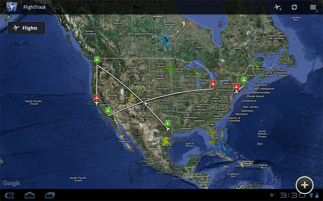
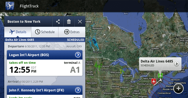
Users can now locate airports and flights on the map and tap them to bring up the corresponding details in the fragment to the left. This layout of locating key information on the map while viewing details in the fragment at the same time is one that’s not even possible on phone-sized screens.
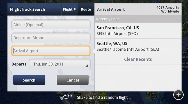
Finding and adding flights is hugely important, and we iterated a few times before arriving at the perfect solution. We think we came up with something fast, intuitive and unlike anything else on Android Market.
We <3 Widgets
We don’t believe in widgets for the sake of having widgets. We wanted to provide a quick, easy, even delightful way to access relevant flight info from the device’s home screen. We couldn’t decide on just one so we’ve included two brand new widgets for you to marvel at.
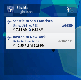
The resizable list widget provides a complete app experience right from the home screen by condensing info from all your flights into an easy-to-read format for at-a-glance flight status.

The second widget is based on our current FlightTrack widget, but revamped in true Honeycomb style. It displays important, up-to-date information about a single flight that we determine to be most relevant to you.
It’s the little things that matter…
We believe that it’s the little things that go a long way in making the best apps on the market. We spend tireless hours perfecting every element in every corner.
For this release, we tweaked the flight adding experience to prompt users along the path of adding flights. When the app is first opened, we present a glowing box encouraging people to add a flight to get started. If all flights are deleted during the course of using the app, the add-flight icon shows a visual cue of the most important element in that situation.
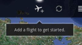
Inspired by the design of the Pulse app reader by Alphonso Labs, we also used a little notch to transition attention from one visual element to the next. This can be seen when moving from one input field to the next in the add flight dialog or transitioning from one tab to the next in the flight details fragment.

FlightTrack for Android tablets: out now.
We spent months bringing our intuitive, easy, and beautiful user experience to Android tablets. You can get download FlightTrack from the Android Market now. Please keep us posted with your thoughts and feedback on Facebook and Twitter. Happy flight tracking!
Iterate. Iterate. Iterate.
We obsess over the details. It’s the Mobiata way. So when we were getting ready to release FlightTrack 4, we wanted to make sure that we had the perfect icon to go with our beautifully updated app. We asked John E., our designer, to redo the existing icon and deliver a much more luxe version.
Here is what we did:
• Added a bunch of borders • Removed a bunch of borders • Moved the map around • Changed the shading around the plane • Made the background darker • Made the background lighter • Changed the plane color. Many times.
After 32 iterations, we had the perfect icon.
Admittedly, the last few iterations were very subtle and are simply color intensity tweaks for shadows, colors, highlights, shading, etc. but being pixel perfect was the goal and so the tweaks had to be made. Some developers view the icon as an afterthought but we see it as a beacon for the brand that sits on the phone’s home screen. We take it seriously.
We asked John about the iterations and he had this to say: “Luxe is a term that I like to use, but I’ve never heard it used other places– you guys are the first company that I’ve seen use it. It sounds like the perfect word when designing for touch UIs and iOS in general, though. It’s a perfect direction to have when creating beautiful products.”
Check out John’s icon iterations in this video he made for us.
Barcelona Diary
A few weeks back, the awesome people on the Android team invited us to show off our apps in their booth at Mobile World Congress in Barcelona, probably the biggest mobile conference in the world. There was no way we could pass up the invitation so we dug out our passports, booked our flights on Expedia and headed out to Spain to show off our apps to as many people as possible.

Since we booked a bit late, the only hotel available to us was in the seaside town of Sitges, located about 25 miles outside of Barcelona. Undaunted, we sorted out the train schedule and mapped the walks to and from the station. What seemed like an inconvenient location turned out to be a pretty amazing blessing. It turns out that we love Sitges. The sleepy, seaside town had a beautiful beachfront promenade and amazing seafood restaurants. We loved returning to Sitges after a long day or describing the benefits of FlightTrack, HotelPal and FlightBoard. It was a great base for us during the conference.
The conference itself was an amazing learning experience. We heard estimates that about 25,000 people came through the Android booth. It felt like we talked to every last one of them. We talked to everyone from officers in the European Commission to young, passionate bloggers looking to write about the next cool app. And we loved talking to all of them. We made a lot of great friends and learned a lot firsthand about what people want from our apps and how they use them. There is no better learning experience than demoing apps to people over and over and over. Since we love nothing more than getting feedback and improving our apps, it was a pretty amazing few days. Even better, we got some great press write ups all over the world.
And now we’re back, over the jet lag and cranking away and some pretty awesome new stuff with memories of Spain keeping us warm.
Staying Ahead of the Curve - Q&A; with Patrick, Aviation Tech for UPS
We’re always interested in how people are using our apps so when we got a note from Patrick about setting repeating flights in FlightTrack, we decided to ask him a little bit more about who he is and how he uses the app.
What do you do for a living and where?
Aviation tech, UPS, Chicago’s O'Hare Intl Airport
What phone do you use?
DroidX
Can you tell us how you use FlightTrack for your job?
We track departures and arrivals on several different flights each day to help prepare for their service and maintenance. We use the app to help plan and schedule our days. We get between 4 and 6 flights on a given day at varying times so the app helps schedule that.
How does FlightTrack help you in your job?
In addition to above we get up-to-the-minute delays and changes in flight time and number on the tarmac so we always stay connected. Constant accurate updates in a mobile form helps me be more efficient and allows me to give attention to arriving aircrafts as they arrive. The app takes the guesswork out of scheduling so I can do what matters: give arriving aircraft the attention they need.
Any anecdotes using FlightTrack?
This AM at 3, I received my first flight info on my commute to work. The flight was going to arrive much earlier than expected and it was nice to have that info as I was heading in. Because of that, I was well informed and hit the door running where normally I would have been way behind the curve.
Thanks so much, Patrick, and thanks for talking with us!
2010 Recap
Wow. We were reminiscing about the crazy year we’ve had as we digest our holiday meals and figure out what to do for New Year’s Eve. We decided to make a list of all the apps we launched this past year on a scrap of paper and it‘s not a bad list. We actually needed two scraps of paper. Of course, this doesn’t take into account all countless improvements we‘ve made on our existing apps as well.
Here’s what we released in 2010:
March - FlightTrack for BlackBerry
April - FlightTrack and FlightTrack Pro for iPad
May - StayHIP for iPhone and Android
June - FlightTrack for Palm webOS
July - HotelPal for Android
August - HomeAway for iPhone
August - FareCompare for iPhone
October - FlightBoard for iPhone and iPad
November - FlightTrack 4 for iPhone and Android
We can’t wait to show you all amazing things we’re planning for 2011.
Thanks for helping make this an amazing year!
Happy Holidays

Happy holidays from everyone at Mobiata. If you are traveling, best of luck out there. If you are staying put, we hope you have a cozy holiday weekend.
We’re closing up the office for a few days to spend time with our families and loved ones. We’ll be traveling, too, so maybe we’ll see you in the security line.
A Crazy Week
As some of you know, FlightTrack turned 2 last week. It first went live on the iTunes App Store on November 17, 2008. What an amazing two years! You might also have caught that we recently released our biggest update ever as well: FlightTrack 4 and FlightTrack Pro 4 for the iTunes App Store and the Android Market. We refreshed the UI and added several new features, and we think it looks pretty amazing. We’re really excited to hear what you think.
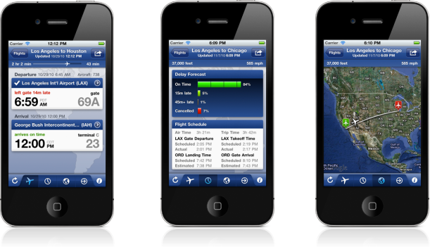
Another great part of the last two years is that our hard work brought lots of interest. People from the press wanted to write about us. Travel companies wanted to work with us to bring their brands to mobile. And one company asked us not only to work with them, but to become a part of their family. When we thought about it, it made perfect sense. We think Expedia has always been dedicated to giving travelers the best tools to help them travel and that’s our goal, too. As we talked more with them, we realized that our goals were aligned and that joining them would help us do exactly what we set out to do every day: help you travel smarter.
And so we’re incredibly excited to announce that we are becoming part of the Expedia family. Don’t worry, Mobiata will remain a separate brand and our team will continue working tirelessly to make apps that delight you. And yes, we’re staying in Ann Arbor.
Thanks again for your support over the past two years.
The Trouble with Time Zones
A FlightTrack user in Australia pointed out that the time zone info we show for Coolangatta Airport (OOL), also known as Gold Coast Airport, might be incorrect. The take off and landing times were correct, but the actual GMT time zone we show for reference had a potential issue. Since we are perfectionists at Mobiata, we looked into it and found something interesting. The problem is that the boundary between the State of Queensland and New South Wales runs directly through the middle of the runways so that one side of the airport is in daylight saving time and the other isn’t. The Coolangatta OOL terminals are on the Queensland side of the border and so have the GMT+10 time zone. We currently show GMT+11.
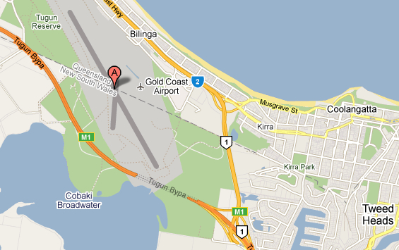
It’s really a toss up about which time zone to show, but more importantly, we love hearing about these great facts of travel info from around the world. And we love getting emails from FlightTrack users about things that come up as they are using the app.
Keep the emails coming and travel safe!
FlightBoard
The buzz around FlightBoard’s launch yesterday was amazing and we are really excited at the initial success. I wanted to give a little background on the app because it’s a cool story. Last Spring, when the Eyjafjallajokull volcano grounded flights in Europe, the New York Times ran some pics showing the effects on travelers. One pic really stood out to us. It showed the Arrivals and Departures board at Charles de Gaulle Airport with all the flights reading “cancelled.” While the news was tragic, the board had this beautiful look about it that conveyed so much about the romance of travel. We were a bit mesmerized by the pic.

The thing is, flight boards are such an iconic part of the travel experience. At their best, they are exceedingly functional and really well designed at the same time. Since that combination is the essential goal of everything we make, we decided to make an app that turned the iPhone and iPad screen into an actual flight board. It’s a simple idea but the goal was to craft the app in such a way that it had the elegance of the board at Charles de Gaulle and the functionality of a really great mobile app. Two of our engineers, Ben A. and Sebastian, spent a lot of time getting it just right. They obsessed over the details – the way the text flips, getting the glow on the font just right, making sure that the sharing features were easy to use but didn’t immediately detract from the design and so many more things. And the result is an app that we were really excited to release.
The more we play with FlightBoard, we find that we search for our favorite cities and start to daydream a bit looking at the all the flights taking off and landing at the airport. We think the app will be a great addition to your travel apps because it will not only help you easily monitor flights but it might also let you daydream a bit about your favorite travel spots.
Partnerships
Hey everyone,
We’ve launched some amazing iPhone apps over the past few weeks with some great companies. This is something you will see from us from time to time. We are dedicated to bringing you the best travel tools for your phone and sometimes that means working with incredible companies who have created really cool services for travelers.
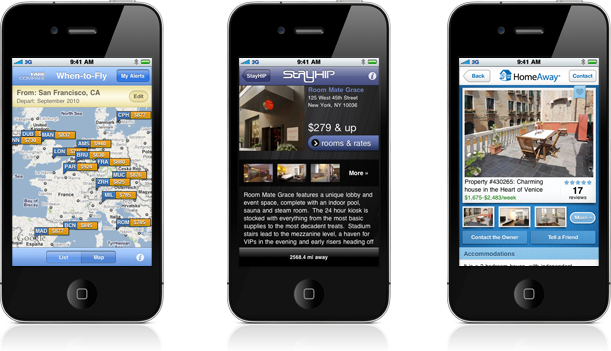
The app that just came out last week is called FareCompare When-to-Fly Airfare Alerts and utilizes the FareCompare service to get you the best airfare travel deals possible. You can set alerts and get real-time info as airline prices drop on your favorite routes. It’s such a cool app because it lets people get instant access to amazing deals. To quote FareCompare CEO Rick Seaney, “You can’t carry your desktop in your pocket.” And that’s why the app is so amazing – it takes advantage of mobile. We’ve all signed up for alerts for our favorite routes and we hope you do, too. If you see us fumbling with our phones, we might not be checking emails – we might be booking a flight to Italy.
The other app we put out with a partner is the HomeAway – Vacation Rental Search app. HomeAway has over 230,000 properties in their database including properties all over the world. Vacation rentals are a great alternative for travelers who want more amenities and space for their money. We’re really excited by how easy it is to browse the properties, look at the pics, check out reviews and read detailed descriptions about the place. As we were developing the app, we would show each other pics and say things like, “Check out that hot tub!” We love how the app has a way of getting people excited about travel. We’re eyeing a few properties in the app - especially the beach ones. We think a big house by the beach with Wi-Fi might be a good way to get Team Mobiata together for a Q4 meeting.
We also put out an app with TRAVELCLICK™, the leading provider for ecommerce solutions for hotels, a few months ago. The app, StayHIP, has done really well and was even picked as one of the best travel apps of the year by Travel + Leisure magazine. If you haven’t checked it out, it’s a free search and book app for boutique hotels. The hotels are chic, swanky and the full screen pics shows them off in all their glory
We hope you’ll have a chance to download these apps and use them to book your next trip. We think they are pretty awesome and should give you more tools to make traveling easy and fun.
Let us know what you think and stay tuned for some really cool new apps in the very near future as well as some pretty amazing new features in FlightTrack, Flighttrack Pro, HotelPal and TripDeck. We’ve got a lot in store for you.
Thanks, everyone.
Moving
Hi everyone,
As always, there are lots of things happening at Mobiata, including one really big change – we’ve moved offices! Right now, we’re in the process of moving to the amazing, historic Nickels Arcade. If you are not familiar with Ann Arbor, Nickels Arcade is an 261-foot-long arcade built in 1918 and has a beautiful gallery roofed with a gable skylight with metal and glass panels. It’s been a key part of Ann Arbor since its completion, and we’re really excited to call it our new home. For those of you who keep asking about iPad versions of our apps and new features to our existing apps, you’ll be happy to know that Comet Coffee is near our office and with help from their amazing coffee, we’ll probably be up coding half the night. It’s so good, and it’s that strong. So watch out for a healthy dose of caffeine-fueled app updates!
One of the coolest parts of the new space is the decorations we’ve been able to get from our friends at the Detroit Metro Airport. We were allowed in to the old Smith Terminal of the airport to salvage some pieces for our new space. It was amazingly hot since there was no air conditioning — plus the occasional dead bird made the scavenge interesting — but Team Mobiata came away with some amazing objects for our new space. Here are some pictures of the mission.
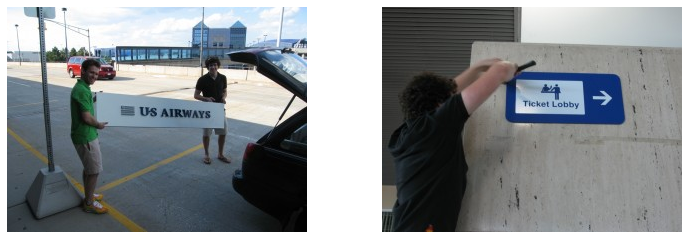
So let us know if you are headed to Ann Arbor and maybe we can meet you for a cup of coffee at Comet, and we’ll show off Nickels Arcade.
As always, thanks for being part of the Mobiata community and for your continued support.
Pure CSS Mobiata-M
Hey everyone,
Thanks for reading our new blog! We’re having lots of fun and doing lots of awesome things here at Mobiata. We’ve just launched the FlightTrack FlightBoard add-on, which brings a beautiful Charles de Gaulle-style flight board to your iPad, and we’re working on some new partner apps as well.
In between making great apps, we do also take some time for fun. Check out this recent masterpiece from our summer engineering intern, Ben Asher. After hearing from our engineer Eric Garcia about CSS border hacks that let one do all sorts of vector drawing in CSS, Ben thought it would be cool to see if he could make the Mobiata logo in pure CSS – no images. Check out what he came up with!
Ben says:
First, I started with circle background. I used two divs with different background colors, one inside of the other, and they both have border-radii of half of the width and height (which are the same) to make the circles. I found a great tutorial on how to make css border-radius work in all the major browsers without images here: http://jonraasch.com/blog/css-rounded-corners-in-all-browsers. I used the same technique for the humps on the m, using one circle to punch-out another, and I added another rectangular div to hide the bottom half of the humps.Nice work! You can see the logo here: mobiata.com/m-test.htmlThe vertical lines for the m are just rectangular divs. Keep in mind that everything you see here has the position property set to absolute.
Next are the arrows, which are a bit tricky. There are two triangles, which I made using the css border property. You can see how this works here: CSS tutorial. There is an outer triangle and a smaller inner triangle, which punches-out a hole in the outer triangle to create the arrow shape (similar to how I punched out the m hump shapes and the background circle shape). Then, I added two more triangles, one to each end of the arrow shape, which made the ends flat at a 45º angle. Basically, I’m using triangles to hide the ends of the arrow by making them the same color as the background.