FlightBoard
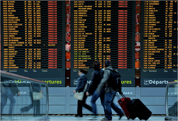
The buzz around FlightBoard’s launch yesterday was amazing and we are really excited at the initial success. I wanted to give a little background on the app because it’s a cool story. Last Spring, when the Eyjafjallajokull volcano grounded flights in Europe, the New York Times ran some pics showing the effects on travelers. One pic really stood out to us. It showed the Arrivals and Departures board at Charles de Gaulle Airport with all the flights reading “cancelled.” While the news was tragic, the board had this beautiful look about it that conveyed so much about the romance of travel. We were a bit mesmerized by the pic.

The thing is, flight boards are such an iconic part of the travel experience. At their best, they are exceedingly functional and really well designed at the same time. Since that combination is the essential goal of everything we make, we decided to make an app that turned the iPhone and iPad screen into an actual flight board. It’s a simple idea but the goal was to craft the app in such a way that it had the elegance of the board at Charles de Gaulle and the functionality of a really great mobile app. Two of our engineers, Ben A. and Sebastian, spent a lot of time getting it just right. They obsessed over the details – the way the text flips, getting the glow on the font just right, making sure that the sharing features were easy to use but didn’t immediately detract from the design and so many more things. And the result is an app that we were really excited to release.
The more we play with FlightBoard, we find that we search for our favorite cities and start to daydream a bit looking at the all the flights taking off and landing at the airport. We think the app will be a great addition to your travel apps because it will not only help you easily monitor flights but it might also let you daydream a bit about your favorite travel spots.