FlightTrack 4.1- Redesigned for Android Tablets
The process of bringing FlightTrack to Honeycomb was a labor of love. Since 2008, with every iteration of the app, we’ve done our best to improve the user experience while keeping things simple and elegant. For every major platform release, we‘ve also kept our core design philosophies yet rethought elements to best fit the experience and features available. FlightTrack 4.1 for Android is no different. We’re proud of this release and hope you enjoy it!
Here’s a walk-through of some of the core features for 4.1.
Map-centric experience: View all your flights at once
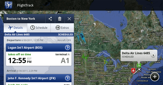
The map-centric view in FlightTrack was designed on a simple goal: let the beauty of the map come through while still making sure the information gets conveyed in a useful fashion. We used the Google Maps app as inspiration in accomplishing that. Adopting the app’s clean, single-fragment layout gave us great insight in how to pull together the perfect blend of textual and visual information. The result: we display the flight details and flight list to the left overlaid on the map view.
We obsess over UI and we always strive to balance aesthetics with functionality. Since map views are such a key part of the flight tracking experience, we really wanted to nail that with the larger screen. Showing all the saved flights at once is something we couldn’t accomplish gracefully on phones, but it makes perfect sense on tablets.
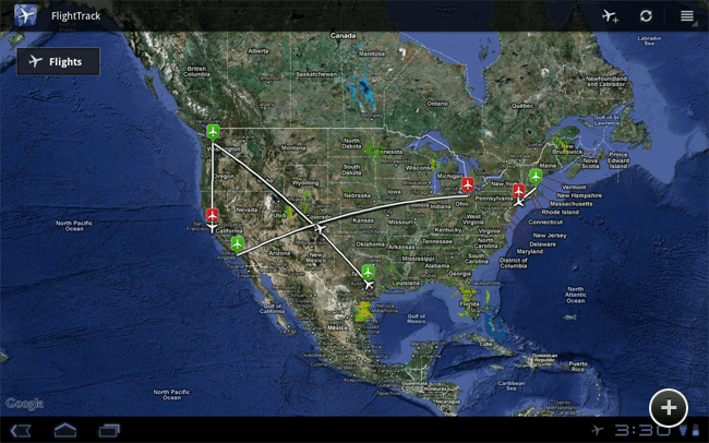
Users can now locate airports and flights on the map and tap them to bring up the corresponding details in the fragment to the left. This layout of locating key information on the map while viewing details in the fragment at the same time is one that’s not even possible on phone-sized screens.
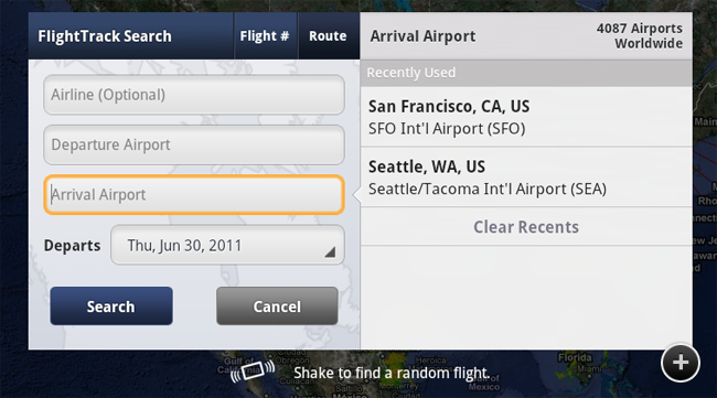
Finding and adding flights is hugely important, and we iterated a few times before arriving at the perfect solution. We think we came up with something fast, intuitive and unlike anything else on Android Market.
We <3 Widgets
We don’t believe in widgets for the sake of having widgets. We wanted to provide a quick, easy, even delightful way to access relevant flight info from the device’s home screen. We couldn’t decide on just one so we’ve included two brand new widgets for you to marvel at.
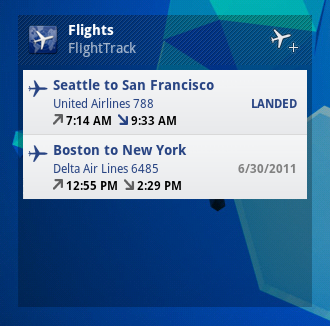
The resizable list widget provides a complete app experience right from the home screen by condensing info from all your flights into an easy-to-read format for at-a-glance flight status.

The second widget is based on our current FlightTrack widget, but revamped in true Honeycomb style. It displays important, up-to-date information about a single flight that we determine to be most relevant to you.
It’s the little things that matter…
We believe that it’s the little things that go a long way in making the best apps on the market. We spend tireless hours perfecting every element in every corner.
For this release, we tweaked the flight adding experience to prompt users along the path of adding flights. When the app is first opened, we present a glowing box encouraging people to add a flight to get started. If all flights are deleted during the course of using the app, the add-flight icon shows a visual cue of the most important element in that situation.
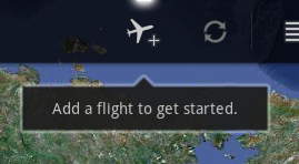
Inspired by the design of the Pulse app reader by Alphonso Labs, we also used a little notch to transition attention from one visual element to the next. This can be seen when moving from one input field to the next in the add flight dialog or transitioning from one tab to the next in the flight details fragment.

FlightTrack for Android tablets: out now.
We spent months bringing our intuitive, easy, and beautiful user experience to Android tablets. You can get download FlightTrack from the Android Market now. Please keep us posted with your thoughts and feedback on Facebook and Twitter. Happy flight tracking!